4 icons and 4 larger graphics
Mar. 30th, 2013 04:51 pmThis is my entry for the 25th round of ![[livejournal.com profile]](https://www.dreamwidth.org/img/external/lj-community.gif) farscape_20in20.
farscape_20in20.
This is my first time making larger graphics, I hope you like them! :)
Comments are the best :D
Please don't hotlink!


This is my first time making larger graphics, I hope you like them! :)
Comments are the best :D
Please don't hotlink!


no subject
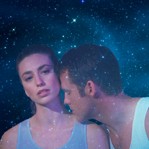
Date: 2013-03-30 06:34 pm (UTC)I also like the Sikozu one a lot. :) And the blending on the J/A one from AHR is very nicely done. :)
For a first time doing larger graphics, these are quite good. :)
(no subject)
From:no subject
Date: 2013-03-30 10:05 pm (UTC)Nice job!
(no subject)
From:no subject
Date: 2013-03-31 05:11 pm (UTC)(no subject)
From:no subject
Date: 2013-03-31 09:20 pm (UTC)(no subject)
From:no subject
Date: 2013-04-01 03:10 am (UTC)(no subject)
From:no subject
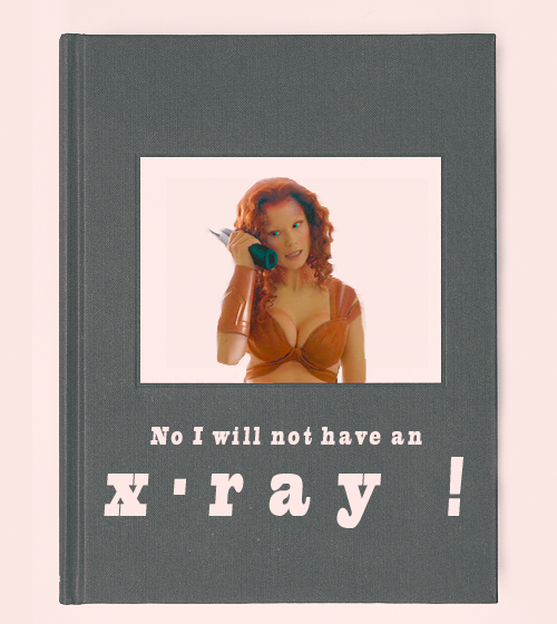
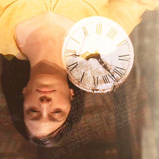
Date: 2013-04-01 05:16 pm (UTC)The relative simplicity of the J/A one works really well and the starry texture use is really lovely and enhances the dreamy romantic vibe of the scene awesomely. The 3rd one has some incredible texturing going on, I really love the grunginess of it and the contrast too, and the 4th one is awesomely creative and gorgeous and I love how you've used text textures and that clock really effectively to give it more composition.
The icons are lovely too ofc, love the crop and grunginess and the intense red in the John/Crais one (well I'll just call it that cause they look like boyfriends in that image :D), the crop and the purples in the Zhaan one, the simple negative space and mutedness and the fun rotated text in 3, and the texture use, delicate contrast, muted colors, blending, text and ok pretty much everything about 4 ♥
Fantastic job! :)
no subject
Date: 2013-04-03 01:54 pm (UTC)(no subject)
From: